 Aki
Aki
These aren't super common to edit in Essentials but can still be helpful for general game development:
Aki
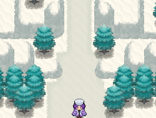
Here's one that might catch you off-guard, but if you're looking for inspiration while designing certain parts of your region... maybe try something like Window Swap. Just chill out and see the kinds of places people live. Maybe this won't apply to most devs, who go in with strong ideas about where their region is based, but I allways prefer a fantasy approach where I'm not tying myself down to "This Pokemon region is a recreation of my home state" or something. Forgive me then for sharing a link to a cozy and transient site, but this is Neocities so I feel some obligation to send you through unconventional rabbitholes in the web.
Aki
I originally posted this to Relic Feb 19, 2017. It's gotten a few spotty updates over the years so some style might be outdated.
Just drop these into the pictures folder to use. Please do credit me (Akizakura16) if you use them!
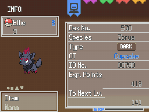
First, a couple style imitating the main series:
Gen 5 style
Download includes 2 versions: compatible with Essentials v17, and the old 16.2
Contains graphics for: Summary, Party, and Pokedex
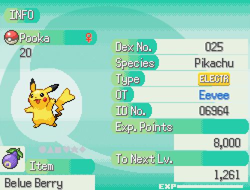
Gen 6 Style
Download includes 2 versions: compatible with Essentials v17, and the old 16.2
This example shot is from v17
Ribbons Style
Made compatible with Essentials v16
Go Style
Download includes version compatible with Essentials v17, and the old 16.2 compatible version!
I never played a lot of Go, but he UI is pretty.
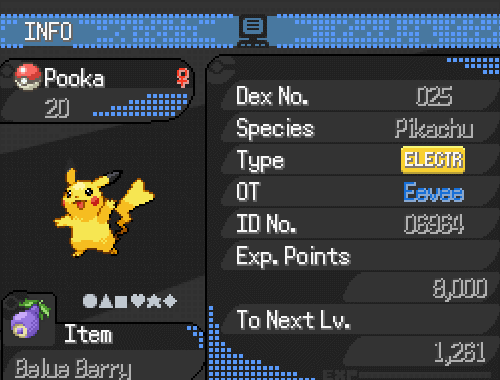
Broken Pixels Style
Download includes version compatible with Essentials v17, and the old 16.2 compatible version!
This was inspired by a dark UI that r/pokemon had for a brief moment of time.
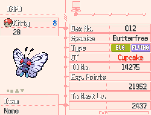
Dainty Style
Made compatible with Essentials v16
This style was randomly inspired by a restaraunt menu.
Rocket Style
Made compatible with Essentials v17
An edgier recolor of Dainty Style, because I allways like that one even if it wasn't very popular.
DexNav Style
Compatible with Essentials v17
A style based on the DexNav of Aplha Sapphire/Omega Ruby
Aki
I originally posted this to RelicCastle on May 25, 2017. I'm only reposting, without updating, so apologies if this information is no longer accurate.
Fogs and Panoramas
Let's talk graphics! If you're looking for something special to help set the mood, you might consider trying out some Fogs or Panoramas; but what are they?
Fogs
- An image that lays over the entire map
- Can be a still image or an animated .GIF
- Can be any size; if it's not as big as the map it will be tiled/repeated to cover everything
- Transparency can be controlled in RMXP
- Can be set to move through RMXP (the image can slide in the direction+speed you set)
Fogs do not:
- Have priority settings. They are allways on top of everything.
- Stop moving or change direction unless you event them to do so.
- Cross map connections. Even if the same Fog is on both maps, it does not load properly and will be cut off.
Here's an example of the difference a fog makes. On the top are screenshots without any fog, and below them are the same areas with a special fog.
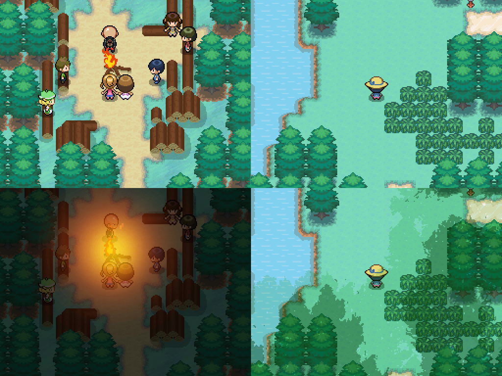
Now I'll show off some fogs in action.
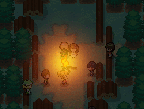
The flames are a character sprite, but the glowing effect is an animated fog.
Whoops I got into a battle! but the tree shadows here are a fog that's being moved by RMXP.
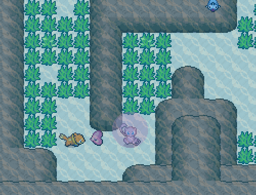
In this screen, an animated fog creates the underwater look.
Here the fog creates beams of light that the characters can walk through.
This fog adds animated fireflies and a night tone.
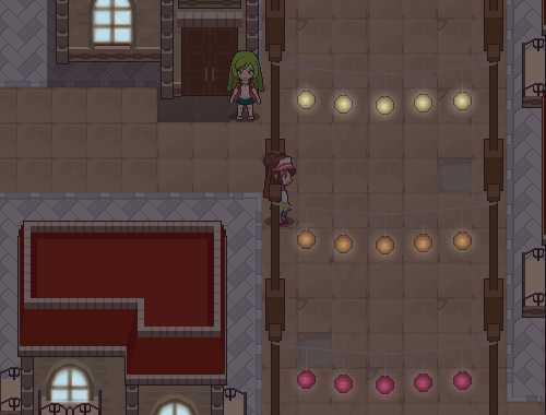
With this fog, the windows glow and each colored lantern glows in different colors.
How to set up a fog
Step 1 is to make your image. then stick it into your project! Just look for the Graphics Folder, and then stick your image in the Fogs Folder.
Aki tip: You actually don't need to double the size of your Fog like with other graphics in Essentials. By default they display at 200% their size, so you might save yourself a step there.
Step 2 is set up your fog to be displayed! This can be done by attaching it to a certain tileset so that they're allways together, or something like a Parallel Process event to display a Fog on a certain map.
Aki tip: If you know what map you're going to use your fog on, it's easy to customize it! Set your finished map to 1/2 size view and grab a screenshot, then you can use that as a guide to draw a perfect fitting Fog image.
Step 3 is changing any of the Fog options you want to use!
Fog options in RMXP
Opacity is the transparency of the image. Lower number = Fainter the image appears
Blending is how the Fog mixes with the stuff below it. You probably want to leave this on Normal unless you know what you're doing because it will mess with the colors
Zoom is automatically set to 200. You can leave it like that and not have to worry about doubling your fog images, or set it to 100 if you did.
SX and SY are values that move the Fog. The numbers are usually at zero, which mean no movement, but you can change them to control the speed and direction the fog image moves. The values can be negative or positive, and a higher number will move the Fog faster in that direction. It will keep moving and the image will keep repeating itself so there's no need to worry about seams at the edge of the image.
SX positive =right; negative =left. SY positive =up; negative =down.
The Hue Slider is also on the bottom, and it will of course change the color of your Fog if you slide it. (This only works on colored images, it won't colorize a black/white image)
Here's some visuals of me setting up my custom fogs.
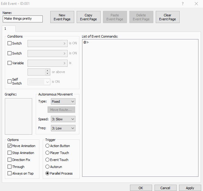
First, setting up a parallel process event to make my Fog appear in-game.
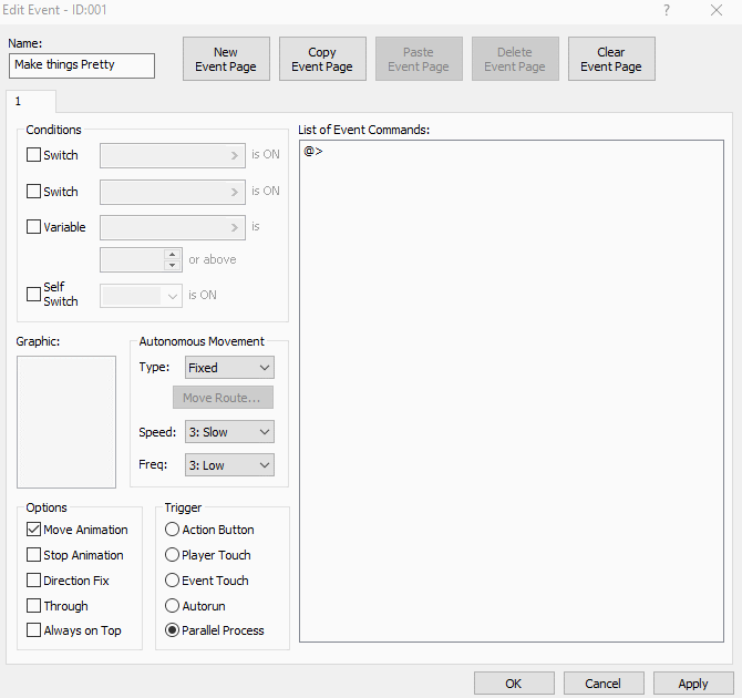
Using an event like this is probably the most involved method of adding a fog, but it gives the dev the most control. with an event I can of course change all the fog's settings based on different game conditions.
The event method is good if you're a perfectionist/control freak like me, or if you want your fog to change based on something like time of day, or where the player is on the map. Another cool use might be a fog that darkens an area the first time the player travels through, but then the fog clears up after the area is cleared.
Here's an alternative method to make a fog appear in-game; setting it up in the Database to make my Fog/Panorama appear everytime I use this tileset.
This type of method can be super efficient in situations such as if you have a tileset just for all your forests, and one fog effect you like to put on all of them.
That's it for fogs, now to talk about another cool visual effect you can pull off in your Essentials game...
Panoramas
are image that lays under the entire map
can be a still image or an animated .GIF
can be any size; if it's not as big as the map it will be tiled/repeated to cover the whole area
are only visible on spaces where there are no tiles, or the first layer tiles have transparency
Panoramas do not:
Have priority settings. They are allways on beneath the entire map.
Move or change. A .GIF can be used to create a moving image, and an event can be used to change the panorama, but there are not built-in options to do that like Fogs have.
Stop where the map stops. If you approach the edge of the map and see the void, the panorama will be there instead.
Automatically stop the player from walking on them, they don't have their own passability setting.
Check out this screenshot where I overlapped the game's window with the map behind it. Notice the sky and plants that can be seen in the game, but aren't on the map?
That's where the panorama is, it appears in-game where I left the map completely transparent with no tiles.
Here's an example in motion, because the cool part about panoramas is how they can slide around separately from the map. It can make for some really artistic perspective shots.
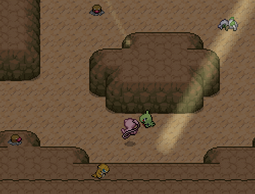
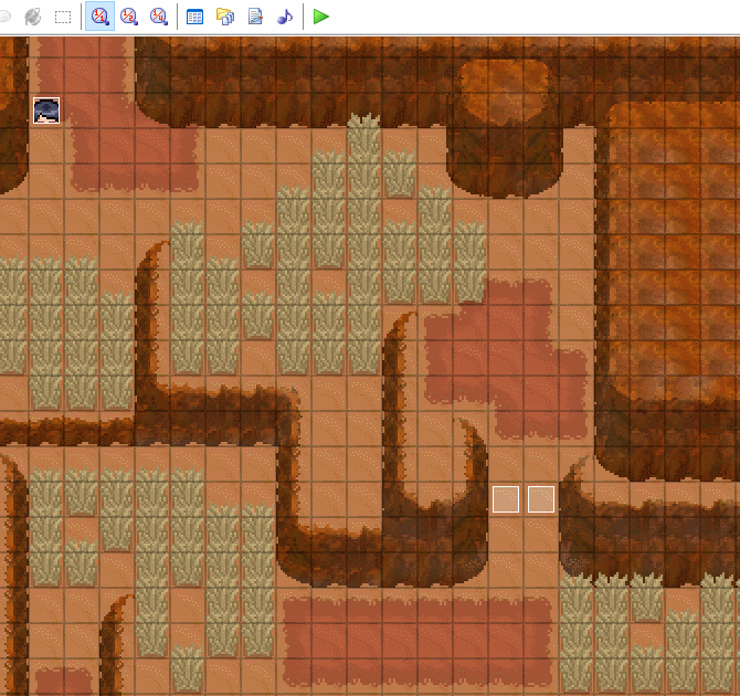
At the edge of the cliff is a Panorama to create a mountain view. There are invisible tiles blocking the player from moving forward, but the Articuno graphic can easilly move on top of the Panorama thanks to checking the Through option in its' event.
I don't have any more good examples on hand while writing this, but Panoramas don't have to just be used at the edge of a map like it is here. Another good use of a Panorama might be creating puddles that the player can walk on, but also reflect a sky full of moving clouds, like seen on Hoenn's Route 120.
So, how to set up a panorama?
Step 1 is to make your image. then stick it into your project! Just look for the Graphics Folder, and then stick your image in the Panoramas Folder.
Step 2 is set up your Panorama to be displayed! This can be done by attaching it to a certain tileset so that they're allways together, or something like a Parallel Process event to display the Panorama on a certain map. Check out the spoiler below labelled Visual Aid
Here's me setting up a panorama in my game through a parallel process event.
And here's an alternative method of setting up in the Database to make my Fog/Panorama appear everytime I use a specific tileset.

And that's it! As usual, no credit needed just for reading a tutorial... but if you're interested in the game that where shown in the screenshots? They're all by me! You'll find them somewhere here on the site, even if they weren't all released.
Yeah maybe the reviews are just for my personal ego but I miss RelicCastle okay I'm writing this bit the day after it was taken offline
Aki
I originally posted this to RelicCastle on Feb 17, 2017.
How Tilesets work in Essentials
Found a cool new tileset you wanna use? Ready to build a tileset of your own from all the cool resources the community has made? Well it can be a little tricky if you've never done it before, so let's go over the basics!
Size
The first thing you need to know about tilesets in Essentials is that each tile is made at a size of 16x16. This is because that's how Pokemon does it. (or at least how the old pokemon games did it, we're in 3D these days of course)
But wait! Pokemon may use 16x16, but RMXP uses tiles that are 32x32! That's why after the tiles are made at 16x16, we double the size of the tileset; then it's the right size, and still captures that Pokemon look! Of course, if anything needs editing, you then have to reverse the process; Scale that tileset down to half size, make the edit, and then scale it back up before putting the set back into RMXP.
When you're changing the size of your graphics there is a way to do it wrong. Most programs want to smooth out your images as you resize them, but this will ruin pixel art. Here are the settings that will keep your pixels crisp:
GIMP= Set the Interpolation to none, and resize by percentages of 200% or 50%
Photoshop= Set the Interpolation to Nearest Neighbor.
Paint= Select all and then drag the image borders to the correct size.
Q: But why can't I just make 32x32 tiles? Or just edit them at full size without the other steps?
A: The short answer is you don't want to. All of the tiles and other graphics in Essentials are double-sized versions of their original resolutions; it's a trick acting like the game is 16x16. If you add something that's 32x32 into the 16x16 graphic system, then you're exposing the trick and throwing off the illusion. This isn't a good thing; it looks bad.
If you're dedicated to making a game that's entirely 32x32 though, you can. You'll just have little/no resources to support you. If you're curious about 32x32 graphics, then check out a game like Kanto Stories.
Q: Do I have to do that 'resize the tileset' thing even if I just want to re-position something on it?
A: Yes. Frankly it's just safer; if you don't move it properly and then do resize it later it'll throw it off anyway.
Q: Do I have to do that 'resize the tileset' thing even if I'm recoloring?
A: Yes, unless you're literally using the paintbucket tool. Shrinking the tileset to it's original size will make less work for you anyway, if you're doing anything more complex.
Format
Like it says on the wiki, tilesets are the width of eight tiles in a row. As for length, that limitation is so great it's better not to worry about it. Luckilly, there are some tilesets out there that are already formatted for RMXP! But there are some things to be aware of when using them, so let's get into examples.
The things I want to be aware of are:
Is the set already double size?
Does it have a background?
What do the shadows look like?
I'm going to grab a tileset by Dawn Bronze. It looks like it's formatted correctly so I'll go ahead and import it into my Essentials game.
The background is all one color and the shadows look to be pure black, so importing went smoothly. The settings shown in this .GIF will make RMXP ignore the pink color, while giving the shadows a little transparency. This could have caused problems if Dawn had made a couple of mistakes when formatting the set; however the background color and shadow color are only used for those respective purposes and not on any of the actual tiles. So everything's good!
Now to just set up the tileset in the Database...
Alright, this tileset is now ready to use! I didn't put any settings on yet, and I'll talk about settings in another section of the tutorial, but for now let's see how it looks when mapping.
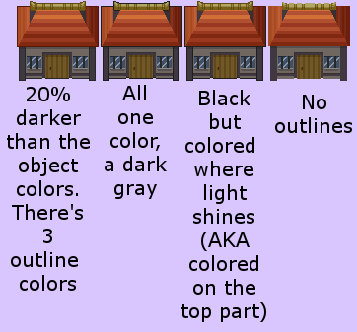
Q: What if I want to use pure black on my tiles and as a shadow?
A: You should pick a different color for one of those things. Take a look at these two images below, the one on the left has the shadows as semi-transparent, the one on the right doesn't. If this seems like too great of a limitation, please take another look at the .GIF above where I was mapping; there's a mailbox visible in the set that has a shadow, while still having a post that I would describe as black. It's all about how you work your colors!
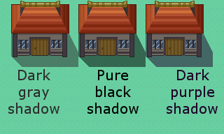
Here is a pure black shadow, as you can see it stands out in a pretty bad way
Alignment
Let's say you have some tiles that aren't formatted into a set yet. If you didn't make them yourself, then you just have to make them fit into the tileset somehow right? Not quite.
For example, I'm going to look some tiles from PixelMister. I took one of the houses and put it on into a tileset twice. Once just kind of slapped in there, and once aligned purposefully. Here's the result when I play.
The problem with the house on the left here is that my player character can't line up with the door correctly. You might also notice that she's standing further away from that house as well. When putting tiles into a set, try to keep in mind how the player will be able to interact with them.
Here's how I had aligned the house on the right; all I cared about was getting the door aligned, because that's the part of the house that the player needs to interact with (if the map was evented, the door graphic would be there of course):
Properties
When you're looking at a Tileset in the Database you'll notice there are a few buttons along the right side. The Essentials wiki explains their basic functions well enough, so I'll just share my tips:
Stuff that the player can sometimes walk on under special circumstances should be marked impassable. I'm talking about stuff like the doors on houses, or water tiles. The door event or surf ability will take care of movement when the time comes, mark those as impassable.
Passage comes in handy for instances like ledges, or if for example you have a fence that you want the player to walk right up to but not pass through. I like to use it on chairs so my player can't walk through the backside of them.
Priority is really important while mapping! No matter what layer you map on, if one tile has a higher priority than another, it will show up on top!
Priority of 1 will cover the player's body, but not head. Higher priority=object is higher above the player.
Use the Bush Flag for your grass, don't make it Priority 1. Trust me on this one, it's redundant at best.
The Bush Flag will erase the bottom of the player instead of putting the grass on top of the player like a Priority of 1 would. It's a softer effect that does make the character look like they're in the grass rather than behind the grass.
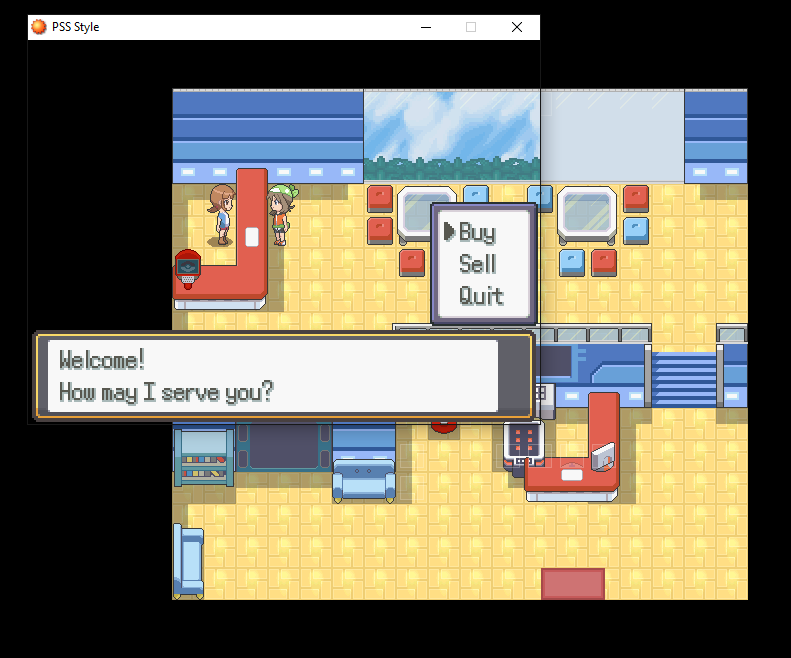
The Counter Flag lets the player interact with an event on the other side of the flagged tile. This lets you do stuff like put all the evening in the Nurse Joy graphic, instead of having 1 event with the graphic and another event on the counter doing all the stuff.
Terrain Tags are the best and you should read up on them; there are special ones that make your grass contain encounters, makes bridges work, and tells Essentials what kind of battlebases to pull up based on the environment.
Higher numbered Terrain Tags need to be added to the tileset from the in-game editor
Autotiles
Autotiles are those tiles that aren't part of your main tilesets, but have their own special folder and can be animated. When you're in the Database, you can assign up to 7 Autotiles to be partnered with a Tileset, and then they're added along the top.
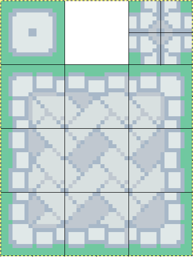
The first form is a single tile, repeated in a row. This is a good choice for animating a single object, like these flowers in Essentials. Most of the examples in Essentials are 4 tiles, and thus, 4 frames of animation, but I believe you can string it out for much longer.
Next there is a form that makes mapping easier. When you have something with corners and want to make complicated shapes with it, you can use this kind of Autotile. I won't try to explain the mathmatics of how it maps, just go ahead and test it out for yourself.
Again I've grabbed an example from Essentials. Can you see how this is formatted? It's 3 tiles across and 4 down. When RMXP is reading this Autotile, it's broken down like this:
So that upper right tile is actually the four inner corner pieces. The upper left tile is what you get when you place 1 of this Autotile unconnected to itself, and is also what appears as the "preview" for this Autotile on your tileset.
This final form combines the two I just listed. it has the easy-mapping functionality while also being animated. So, after seeing how the last form was set up, does this big Autotile make sense? It's the same style, but repeated for many frames in order to animate. Like a single tile animation, you can have as many frames as you want here.
As usual, if this tutorial helped you, yay! No credit needed though, just go make games!
Aki
I originally posted this to RelicCastle on Feb 17, 2017. I'm only reposting, without updating, so apologies if this information is no longer accurate.
Game Aesthetics
These aspects reflect your aesthetic style in ways that can be hard to objectively measure!
Your personal mapping style; Do you like trees in straight rows, or staggared? Are you the type to place small decorative tiles everywhere, or keep things simple?
Overall UI design; is there a certain color in every UI? Is it going for a modern look, or a certain pattern or texture?
Screen size; can be more rectangular, a square, or imitate a dual screen.
Anything regarding speech bubbles; using colored text to your advantage, having them scroll or align differently for reading signs versus talking to characters, or choosing to add something like transparency or little speech tails to them.
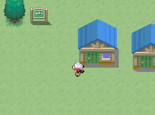
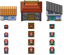
How about some examples actually in context of a game screenshot?
The cliffs and rocks in both of these screenshots are actually the exact same tiles, just seen in different contexts.
Outlines
Some things to think about are how much emphasis each object needs. Typically, something stands out more if it's outlined at all, and will really stand out if that outline is in black. Knowing this, you can try styles like these:
Tilesets that are completely lineless. These really make lined characters stand out, but can also look disconnected from the characters for the same reason.
Mixed styles for different tiles. For example colored outlines on nature tiles like trees, but black outlines on buildings/other man-made objects.
Any mixed style can make for an easy way to show players what can and can't be interacted with. Like in traditional animation when you can tell an object is going to be interacted with by the way it's drawn.
Mixed styles for human characters, pokemon in the overworld, and objects in the overworld. All these are different, so why not highlight that difference a bit?
Using a more uniform style on everything will put less emphasis on specific objects and instead put everything on an even field for the player's attention. When using this style, it can make it even more rewarding for players to discover what objects you've made interact-able.
You can change up styles between indoor and outdoor maps, since those tiles won't normally be seen together. (Probably should at least keep the palettes though)
Shadows
For events you have the option of using a script to create shadows, but what about in your tilesets?
Having solid colored shadows is an option, but if they're a light gray then they're not going to look like very good shadows.
Just having light colored shadows in general isn't a great design decision for most. Adding a slight gray tone over grass tiles or whatever doesn't exactly look like a shadow being cast.
You can change up styles between indoor and outdoor maps, since those tiles won't normally be seen together. (Probably should at least keep the palettes though)
You'll want to coordinate shadows with shading; if an object's shadow is indicating a light source on the left, make sure the shading is saying the same.
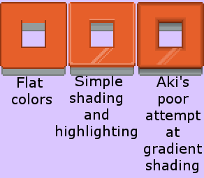
Shading and Highlighting
Shading applies to both characters and objects, so if you don't have a plan ahead of time you might end up with different levels of shading on each!
More complex shading takes more time to edit properly.
You might notice some rips gen 5 have gradient shading; the entire object is shaded, and it doesn't allways make sense for a light source. It's mostly person preference if you like having more colors or think it's muddy compared to more pixelized styles.
Simpler shading ususally lends to a more cartoony look. More complex styles try to imitate a more realistic look.
A lot of lineless styles go for more complex shading, and these things combined might be described as a more realistic look. When lineless styles have simple shading, they can sometimes look too flat.
You'll want to coordinate shading with shadows; if an object is shaded with the light source on the left, make sure the shadows do the same.
Proportions
Is it okay to mix gen 5 sprites with gen 4 tiles?
When making my own tiles, how do I know they're the right size for my characters?
My number one tip is to compare your playable character to a door. Do they reasonably fit together? If they don't fit together at all, then you have a problem, but in this example you can also see that there's some wiggle room on what works.
Of course not every character needs to be the same height, variety is great! But there still need to be some standards.
Head size is usually a constant. Just putting a head on a smaller body can make a character more childlike.
If a building has multiple storeys, they don't need to all be the same size as the ground floor, especially if the ground floor is a size for the player to enter the building; you can cheat the upper storeys much smaller.
Because the door is where a player interacts with a building, it's a good reference point for designing the rest of the building.
For the above reason, comparing door sizes is usually an easy way to tell if two buildings are the same scale.
Pallettes
I'm personally very bad at this, so I'll try not to preach much here.
Mostly this is something you need to get a feel for yourself; there are calculable reasons why certain colors/hues/shades go well together, but there are many different ways to go about making a palette.
A palette can be a very distinguishing feature for any artstyle, and if you're making graphics yourself it's usually best to start here and decide the other aspects after.
Lighting and music
Doing this well really adds a beautiful polish to your game.
I personally am a great fan of using fogs. These are a popular choice for making your forest darker, but can be used for other things
Even if you don't want to use fogs, just take a look at things like different tones and think about what would work best for your project.
As for music, most people already know that it can set a mood on its' own. I just didn't want to skip over it when talking about aesthetics.
Think about a scene of the player walking up the staircase to the champion battle for the first time. With that same scene, music can make the player feel brave and adventurous, or instead tense and reflective. Will the champion's battle music make it a ceremonial battle between a champion and challenger, or will it be a high energy clash between rivaling skills?
Special note: I think something often overlooked in fangames is having a special musical intro play when the player has been spotted by a trainer. With all the nonsensical things a trainer can say before battle, it's just a nice cue to the player that a battle is about to start.
Animation
Quick! Which is more eye-catching?

The only difference here is that one screen has some characters with stop motion ON.
Movement draws the eye and makes things seem more lively. This isn't just a trick for promoting your game either, adding a little liveliness in-game is a beautiful thing!
Adding movement to pokemon characters- inside battle or in the overworld- can really add personality to them.
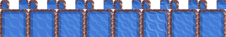
Water is commonly animated, but I'd say that you don't have to animate pond water. Ocean water, or using a water tile that clearly has waves? That stuff is kinda weird if it's not animated, so it might actually detract from the player's experience if it's distracting enough.
Here's an example of water from the same game; in one area the freshwater isn't animated, and in another area the oceanwater is animated. Both screens have animated characters though!
Alright here's the part where I get wordy
I recommend making a set of rules that define your aesthetic. Specific ones. Now you don't ever have to write them down or tell anyone (unless they're making something for you, then please tell that person), but keep them in mind when making or editing resources. What do I mean by rules? Well here's a set as an example:
Overworlds are 5th gen style.
Palettes are taken from HGSS.
Buildings and other objects get colored outlines, but flat things like grass and water are lineless.
Shadows are pure black, and go to the bottom and right of their object.
Following those rules is how I made this screenshot:
The point of having rules is to just be aware in case any style mixing happens; otherwise you end up with a pile of objects that don't match each other all on the same screen. Even if formally making rules isn't your style, please just keep the qualities I listed in mind.
As allways, please point out if I've missed anything, I'll want to add it in!
No credits required at all! This is a tutorial, the knowledge is free!
Aki
I originally posted this to RelicCastle on Feb 16, 2017. I think this was one of the tutorials I posted on the original Relic site though...
There was a couple times where Relic members requested me to write a specific tutorial about something, and even if I didn't feel qualified, I would write it.
This might not be the best tutorial but it was shared fairly regularly... I think just because I was the only person writing this kind of thing specifically for/about the Pokémon fandev community.
There are plenty more generalized tutorials about animation and spritework that can probably teach better techniques.
Animating Sprites: Aki's method
My method may not be the most effective or efficient, but maybe we can pick up some tricks from each other! Okay, here's the process I go through when I animate sprites:
Step 1: The Sprite
Finish the sprite before doing any animation.
Make sure the sprite is already finished; like 100% excellent on its' own without being animated. It will be a pain to go back an make changes to the coloring or design during or after the animation process!
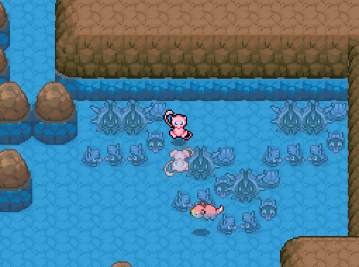
So, since I don't have a fakemon sprite on me right now that meets that requirement...I'll be using this Mew sprite by Speedxaaa:

Now this particular sprite is a bit big because it's hi-res, but I won't be using a different technique because of the size. If I am animating a regular sprite for Essentials, I do so before resizing it.
Step 2: The setup
Get set up in your program of choice.
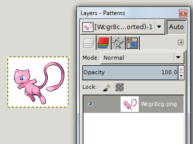
The one I use is GIMP so you'll be seeing screenshots using that program, but in this tutorial I want to focus on the technique and not the program, so I'll try to leave GIMP out of my points.
Here's my setup right now, I've just opened up the sprite in GIMP and haven't done anything else yet:
Step 3: Preparation
Analyze the sprite and plan how it should move.
I like to think a lot about this before I begin...how will I bring out this Pokemon's personality with its' movement? Is it energetic and eager to battle, or is it an evolved veteran that's at ease on the battlefield? What kind of animal is it based on; a prey animal that might be on high alert, or a calm and focused predator?
Here is my analysis on Mew that I've drawn on for the sake of explaining my thoughts:
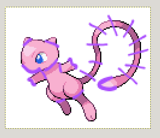 I'm not going to animate the eyes blinking, since I feel like that's easy to overdo.
I know that Mew is a psychic type that usually hovers instead of standing, so I'll probably add some kind of bobbing/floating movement to the entire form.
Mew is a powerful legendary Pokemon, so it's probably not nervous or afraid when battling. More likely it will be calm, or if I recall from the anime/movies, Mew might even be feeling energetic and playful! I'll make sure the body language remains very open and relaxed.
Limbs and ears are allways easy targets when looking for parts to move, but I'm also going to consider the nose, hands, and neck joint. Mew has very short arms, so I can't be sure where the elbows or wrists are.
There's a lot of belly visible, so I could add in some breathing movements, but I suspect that there will be enough movement without that.
For the tail, I'm going to try to make sure that it doesn't move as if it's made of jelly, but as if it is a tailbone with many joints. The tail is a large part of the design, so I think I'm going to target that first.
I'm not going to animate the eyes blinking, since I feel like that's easy to overdo.
I know that Mew is a psychic type that usually hovers instead of standing, so I'll probably add some kind of bobbing/floating movement to the entire form.
Mew is a powerful legendary Pokemon, so it's probably not nervous or afraid when battling. More likely it will be calm, or if I recall from the anime/movies, Mew might even be feeling energetic and playful! I'll make sure the body language remains very open and relaxed.
Limbs and ears are allways easy targets when looking for parts to move, but I'm also going to consider the nose, hands, and neck joint. Mew has very short arms, so I can't be sure where the elbows or wrists are.
There's a lot of belly visible, so I could add in some breathing movements, but I suspect that there will be enough movement without that.
For the tail, I'm going to try to make sure that it doesn't move as if it's made of jelly, but as if it is a tailbone with many joints. The tail is a large part of the design, so I think I'm going to target that first.
Since I'm animating an official sprite this time, I can look at some references if I feel stuck. However, I usually don't want to do that but instead come up with my own ideas. I'll compare my edit to some official sprites at the end though.
Step 4: Simple Movement
Now I'm animating! The still sprite is going to act as my first frame for now, so I'm gonna get started on Frame 2! I decided to start with tail movements, so I've separated the entire tail from the body.
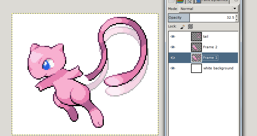
You can see a ghost tail underneath, and that's from Frame 1. I'll be keeping that there as a reference while I change Frame 2. Now here is the tail movement I've decided to go with, I'm gonna unwind it just a bit and spread it out more than it already is, starting with this:
I made this tail by cutting and pasting several bits of the original tail, however I did not rotate any part of it. I simply redrew a couple of corners that didn't line up perfectly. I'm trying to keep 3 limitations in mind as I continue to position the tail:
The tailbone, as I noted in the planning stage.
The shading on the tail is showing depth and should change a bit as the tail moves.
The base of the tail should not move from where it is attached to the body.
That's how the tail is going to look for Frame 2. Now I'm going to use Frame 2 as a ghost guide for myself as I work on Frame 3, and then use Frame 3 as a guide for Frame 4, and so on. I'll move the tail a bit more each time, and then bring it back so that the tail can return to its' original position and create a nice movement loop. Here's what I've got so far:

It doesn't look like much does it? But know I've got one body part moving in a way that I want, and it's the base I'm going to work off of.
Break: Taking a look at some refrences
Next I'm going to add a little movement to the arms, but before I start, I want to bring up some things about the official sprites 2, 3, 5, and 6:


Firstly, As the Mew moves you can see that a lot of the sprite quality-especially the outlines-is lost (not as much in the gen 2 sprite on the far left because it hardly moves). This is because the pieces were rotated without redrawing them at all (not the gen 6 image on the far right, that's a rip of a 3D model turned into a .GIF it looks that way because 3D objects do not have flat outlines, but you can still see how it changes shape when it moves); I personally dislike it, but it is a huge time saver when you've got a lot of sprites to work on.
The second thing I want to point out is how the movement of the tail and arms on the 5th gen sprite (second from the right) has the same pacing. The arms are at their highest point when the tail is closest to the body; The arms are at their lowest point when the tail is reaching furthest from the body. They're in sync, which can be a great thing. But for myself, I want body parts that aren't connected to move independently of each other.
So now that I'm ready to move the arms on my Mew, I'm going to start with...hmmm...Frame 3, as if it was my first frame, and make a short loop with only frames 3 through 7, (as opposed to the tail, which loops its' movement in frames 1 through 8, which is all the frames.). Hopefully this will hide some of the "seems" where the .GIF loops, and make it feel a bit more natural. Let's see:

Mew still looks a bit stiff to me, so I'm going to add some movement to those dangling back legs. I think I'll start with...Frame 6, that's not the start/end of any other movement loops yet.
Step 5: Finishing up
I hope you didn't skip the break tab.
I decided that I wanted the different parts of mew to move independently of each other, and not in sync. That's just a personal choice, let's see how it works out for me.
I did each part individually. First getting the tail movements perfect, then the arms, and then the feet.

Hmm, maybe it looks a little dis-jointed actually? Well, let's see what happens when I add that bobbing/floating movement:

There, I think that ties it together nicely. I saved this biggest movement for last specifically, because I wanted to be very specific in my smaller movements first, and those are easier to see when Mew isn't moving around as much. This might be a totally backwards way of animating though depening on your sprite, it's your call how to prioritize.
I'll call that finished! This process usually takes me 30 minutes or so, but there are flaws with my technique like having to do the backsprites separately, and having to recolor every frame for shiny versions. Also, I like to make .GIFs in order to see my results right away, but Pokemon Essentials doesn't usually use .GIF files for battlers. You'll have to separate out the different frames into the proper format.
Specifics fo GIMP
Here is the finished .GIF when I open it in GIMP
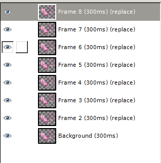
The frames play in order from bottom to top, the numbers will be changed to match the order when the image is exported.
Now as I was working I did use the layers to draw as normal, but when exporting as a .GIF the layers are individual frames
In the first set of parenthesis, you see the 300ms? That's the framerate. That frame will display for 300 milliseconds. I use 300ms but it's very easy to change the numbers to whatever suits you best. Just change the number right there and it will apply.
The second set of parenthesis is how the frames switch from one to another. It says replace so that the frame will completely replace the frame before it. There is another option called Combine which would lay frames on top of each other, but since Mew is on a transparent background, this would look terrible!
Cerdits: None required at all!
Aki
I originally posted this to RelicCastle on Feb 28, 2017. I'm only reposting, without updating, so apologies if this information is no longer accurate.
Quick Anatomy Tips
I just want to start out by mentioning that these tips aren't just specific to spriting, but I'm focusing on that becasue I know that's the style most people are using for their games! If you're looking for some drawing tip though, these will work for that too!
Tip Number One is to never be afraid of looking at refrences, so I've tried to include some images.
Humans
Small children: Round heads and faces with bigger facial features, small hands, limbs and fingers are a little shorter and chubbier. The more you emphasize these things, the younger your character will look.
Do the opposite to age characters more: Longer face, little more space between facial features, ect.
The space between eyes is the same as the width of the eye. Put 3 eyes in a row touching if that helps you get the spacing perfect. This isn't something to mess with too much or it throws the whole face off.
Eyes are about in the middle of the face (height wise of course). Place them first and it'll be easier to place the other features.
Ears? The top aligns with the height of the eyes.
How long are arms? When resting at the sides, the hands should be below the hips but above the knees. If raised straight over the head, the elbows will be right about at the top of the head.
Elbows and knees are in the middle of their limbs. You can use this to measure and figure out the correct angle if you're doing a complex pose and feeling stuck.
A hand with the fingers splayed is about the same size as the face in both width and height.
Heads and Tails
At the very base of your creature, pretend that it is made of circles. Make a little guide if you need to, so that no part of the outline will concave into the body. (I see this most often with the skull, people place the ear too far in)
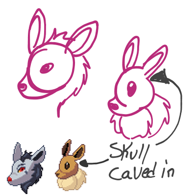
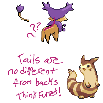
A tail is literally a spine that just keeps going. So keep the line that forms the back going and you'll get the placement just right.
Legs and Paws
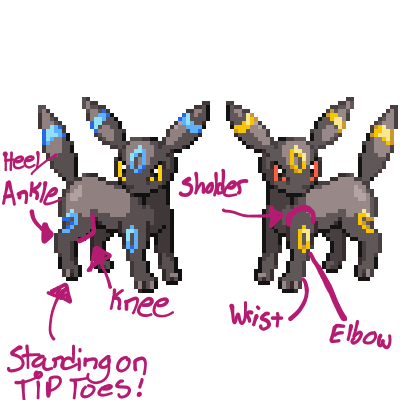
Typical cat/dog back legs have very long feet- the little paw they stand on is their tip toes, and their ankle is up in the air.
Animals typically have 4 toes on each foot, but commonly sprites will simplify that to 3 toes. (but may have a small "thumb" higher up on the leg; you probably won't need to draw this unless it's an important feature of your design)
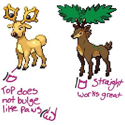
Hooves
Hooves are not paws, they should end pretty flatly on the ground and not have any bumps or toes.
Now if you'll allow me a tangent, here's something that allways bothered me:
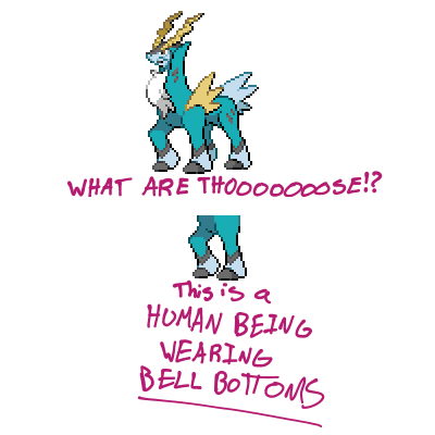
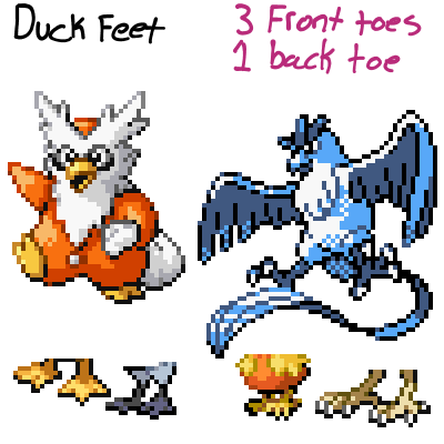
Talons
Bird toes don't all face forward; think of like a claw machines grip and that's a bird's foot. 3 toes in front and one in the back seems to be more typical, but you can do 2 and 2. Webbed feet like a duck's don't allways need a back toe because they aren't gabbing things.
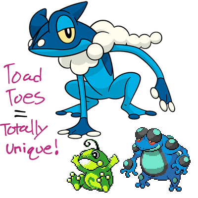
Frogs
Frog feet can be pretty unique so don't just draw paws. Frogs can have webbed feet or these recognizable designs have long toes with chubby ends.
As allways, please let me know if overlooked anything or can improve this tutorial in any way! Hope this helps!